I was thinking to make a research about the cars’ logotypes ( not the main logos ), but I’ve stumbled accross someone’s research that’s actually pretty good and I’m dying to share it with you, so we can make some observations together.
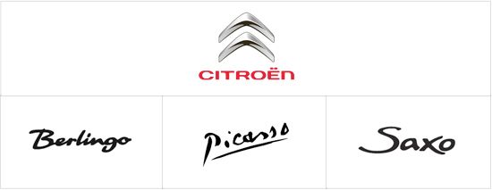
It all began ( in my research ) with the two dots over the Citroën’s logotype. Which are actually called “tréma” in French. It’s a small detail that people don’t notice and I wanted to highlight it. Then the logotypes of the different car models appeared and I’ve decided to check the general situation. Here are just some of them. Once again – it’s not my selection.
Except for the “Picasso” logotype, which is actually a replica of the Picasso’s signature ( the painter ) – the rest are quite boring. Ordinary cars with ordinary logotypes. We’ll discuss the new “DS” line in another post. It’s a different case.
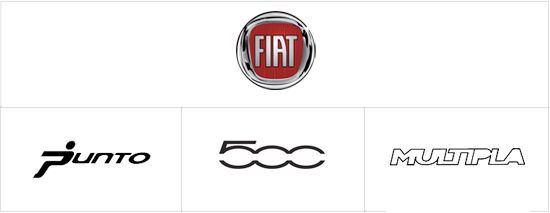
“Punto” is funny.
“500” could be improved a bit.
Nothing to say about the “multipla”
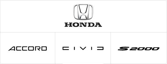
CIVIC has probably the coolest logotype from the whole selection. I bet the guy who came with the name draw this on a sketch.

They’ve got new car designer ( ex Audi guru as far as I remember the story ) and I’m sure we’ll see better logos than these in the future.
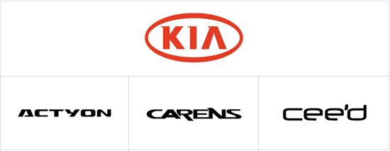
CEE’D could be better, don’t you agree ?
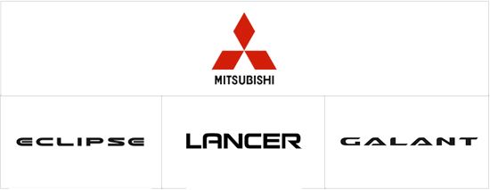
May be “eclipse” bothers me a bit , but every design has an explanation. Probably the designers were under pressure. Overall Mitsubishi cars have great logotypes.
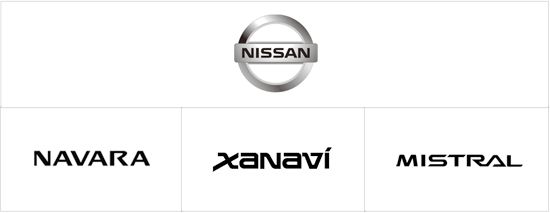
I’m fan of the brand, but the logos could be better. Although – they do what they are designed for – recognition and readability on the road.
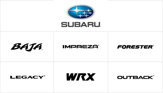
May be better logotypes will come for the next models of Subaru. Great cars deserves great logos… or may be the Subarus are not so great… like the logotypes we see here ?
View more at http://www.logodsgn.com/blog/85-automotive-logotypes/