As you know Starbucks redesigned their logo for their 40th anniversary (2011). Twitter was flooded with the news last week. Bullet points in the story are: Why? They need to sell more stuff than just coffee these days Who? The design (the crop) was home-made ( in-house design by Starcbucks) Who else? Lippincott and BBDO will help for the brand rollout in the next few months. Reaction: designers…
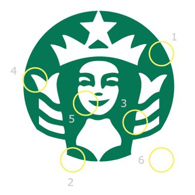
In this post I am going to present you the history and variations of the Starbucks logo. This includes formation of the genuine design and groups of logo designs as part of the Starbucks logo mania. I have compiled several publications on this topic and I have also included some of my own observations. Hope you enjoy it! The first logo of Starbucks resembled a “cigar band” (#2) with a Melusine (#…
What you are going to see are the logos of 3 famous brands that has been used in a “chinese fake mall”, that is building in this very moment. We all know the copycat brands are rife around the world, but I’ve only seen them on goods, not on actual places :) .. till this moment. Pay attention that the “McDonald’s” and the “StarBucks” replicas are designed in just one color. Also Pizza Hut in the…