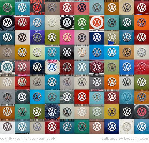
It’s always interesting for a corporate identity designer to see how a logo is interpreted over different backgrounds and colors. I know the VW primary as a glossy car logo, but here you can seen some more variations of it. Sometimes it’s white, blue or even pink. If you look more careful – there’s a difference of the thickness of the lines in some cases. This leads to difference in the spaces between the lines. Even the slightest changes affect the observer. In some cases the letters V and W are even not connected. There’s a line between them. A small one, but it’s there. Do you see any more differences here ? :)
pls, comment
