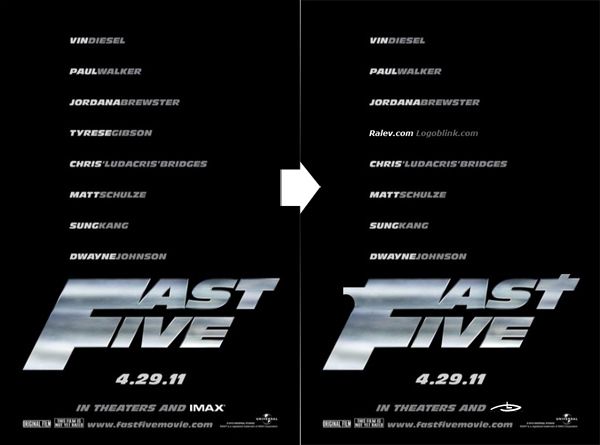
I saw the movie poster and the logo recently. May be it’s just me, but I saw a pistol in it, not just a 2 dynamic / italic words with a common starting letter. So I’ve spend 5 minutes to play with it and make it more readable. As a result – cock at the back and sight at the front were added. I wanted to post it as an illustration of how you can add just 2 little details and transform what you think is already finished.
So every time we are looking at our “final” designs .. may be they deserve some extra polishing effort, who knows. By the way – I think the logo needs more work :) Do you like the new version ?