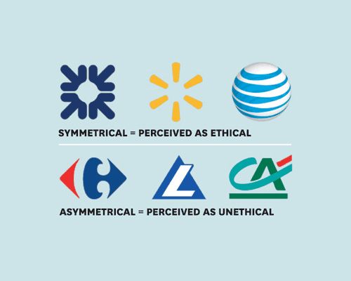
Niels van Quaquebekeand Steffen Giessner of the Rotterdam School of Management showed logos of 100 Global 500 companies to two groups of participants. One group rated them on attractiveness and symmetry; the other judged whether the logo suggested that the company behaved ethically. The result: Rationally or not, people associate symmetrical logos with more ethical, socially responsible behavior.
source: hbr.org via: iamjustcreative
All kind of symmetry and mirror images are welcomed by the viewer. This is also the main motive plastic surgeons present to future customers – to make you “symmetrical”. Every designer knows that there is no absolute symmetry in nature. Perhaps this is why people like it so much… and associate with it with positive things. If you are a photographer and you are paying attention what photos in the photo forums are liked most – you’ll see my point.
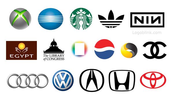
Here are some more samples of famous mirrored/symmetrical logos:
If you pay attention to details you will notice that some of these logos no longer exist. Adidas, Egypt, Pepsi, Scribd, Symantec, The Library of Congress – they are all using new asymmetrical logos now.
Maybe the next move for Starbucks will be to make their logo asymmetrical, too. Nike hasn’t changed the swash because it’s a sport symbol, a symbol of human progress, a striving for perfection, but is still human. So the company is holding on to the same asymmetrical mark.
Why do so many car brands use a symmetrical logo? Because one such logo symbolizes the perfection of their products – the machines. A machine is artificial and is supposed to be and designed to be perfect. Also, the target group of the car companies is a wide range of consumers, so they bet on a safe logo. In the upper-class brands there is more freedom concerning logo designs. You can notice logos like Volvo, Lexus, Jaguar, Rolls Royce – they are all good working asymmetrical examples.
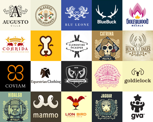
here you can see a selection of not-so-famous symmetrical logos:
picture source : hongkiat.com
- People recognize symmetry when it’s vertical (most of the cases)
- Use one color to highlight your symmetry
- Symmetry was and will always be trendy, but boring
- Symmetry is something people design when they need a safety net. A symmetrical design is easy and quick to achieve with proven effect. However, I doubt this will help you leave a mark in the brand design history.
- Since symmetry is artificial – at some point it should convey some sub message for deception (although no research has proven this suggestion yet)
- If you need to break up a symmetry logo – you can just put some neat element in the top right corner of the composition. In this way you’ll preserve the quality of the composition and will inject some asymmetry in it. A TM or ® will also do the trick. Another trick is to rotate the axis of the symmetry – as in the Carrefour or the BMW logo.
- Do not mistake a well-balanced design composition with cheap mirror-based image
- We haven’t been part of the research project so don’t take everything you read for granted.


