I was first impressed with the package… then I’ve noticed that they’ve used the logo on a few different places without overdoing the identity. The logo itself is nice in both of the variations – the positive and the negative glass, formed by the two faces, the two strangers. It’s a famous optical illusion, used in many places with different proportions. I hope this nice package design will inspire…
There’s a brand new great interview with the designer of the Apple logo, Rob Janoff. Here are a few lines from it : Jean Louis Gassée (executive at Apple Computer from 1981 to 1990) : One of the deep mysteries to me is our logo, the symbol of lust and knowledge, bitten into, all crossed with the colors of the rainbow in the wrong order. You couldn’t dream of a more appropriate logo: lust…
If you are not watching television or just MTV, may be you haven’t seen this logo yet. Client: Mtv.de Agency: bbdo.de Executor: s-farm.de Found via: pinkEYE The logo is a part of a short video spot. Watch it here:
Here’s what we read in Michael C. Place’s ( BUILD ) blog : “A while ago we received an email from Gary Hustwit the director of ‘Helvetica – A Documentary Film’ asking our advice on what type I would use for a new documentary he was producing on product design. We replied saying it might be nice to make the letterforms from actual products, he liked the idea, and would we be up for doing it? We…
A-style is a clothing brand. The brand exists since 2003 (or at least the domain a-style.it is registered during that year). However, 2006 could be considered as a real breakthrough. Later a friend of mine sent me an A-style key holder from Italy. If I have to be honest I didn’t get the idea at first sight… but later there was the “LOL” effect. :) Cool idea, designed in a nice way. Everything is…
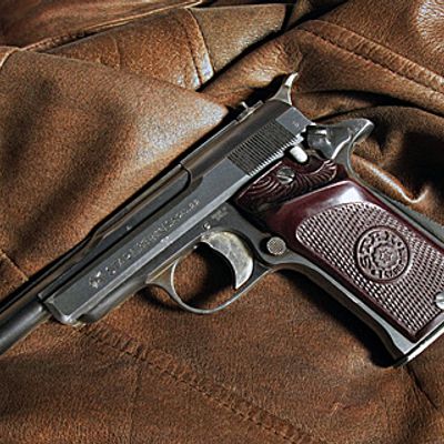
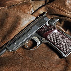
It’s always good to know the proofmarks for different standards :) gun proofmarks 1 – Idnicates admission to ( receipt at ) proof house. Used after 9 July 1931 2 – Proof of test – automatic pistol from Eibar proof house. Used after 1929 3 – Indicates year of proof. Date is 1946 4 – Acceptance bu military inspectors from Spanish service
Hope you’ll appreciate this rare Landor’s interview. It’s uploaded a month ago.. but still it has 4 votes.. so I guess, just a few real logo designers has seen this before you and me :) Enjoy!
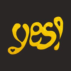
Today I was watching a movie on TED and saw this logo. It’s interesting and original in the sea of bulb-related-logos out there. Seems to be a very cool design for a t-shirt or something. I was so charmed by the idea of the logo that I vectorized it for you on the run. Click on the picture above to download the EPS file. I’ve searched for a while to find out who the designer is, but found no clue…
It was a long time since I’ve visited www.davidcarsondesign.com and I just digged these for you. Color is yellow because it’s a part of rebranding work for Western Union. Positive waves, catching the eye shapes.