Who appreciates a glass of good wine here ? :) What about good graphic design? In this post about wine logos we have combines these two passions of ours. Here you can see 32 conceptual logos of wines from all over the world are presented… Enjoy it!
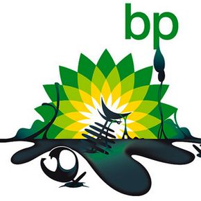
We all know what British Petrolium ( BP ) had caused to the environment … , so here the response of the people trough the eyes of the logo designers all around the world : Also can use film covers, that people are familiar with, to express those opinion, in this case, it’s shown the precise field where they cause damage. Funny results… but huge message!
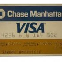
Today I’m gonna talk about one brand that is always present in ours lives… or better… in ours wallet. It’s the famous blue, white and gold logo that has earned a permanent place in the minds of the consumers around the globe… The VISA Brand. The Visa International Service Association, how we know today as VISA, born in 1958 when the Bank of America launched the pioneering BankAmericard credit card…
Nowadays, a new wave of creation of corporate identity is growing… The age of static logotypes may has finished, it’s the new era for dynamic logos, here the image can be changed, can move… but, nevertheless, still maintain themselves identity that characterizes them. In this post I’ll show three brands to use as example that what I’m talking about, three brand that use a dynamic logotype. Each…
I’ve just grabbed my camera and shot all the logos I could easily find in the kitchen. They are not listed in a specific order and most of them do not represent local brands, but still – they are all kitchen logos we can learn something from. May be ;) 1 – We have to admit – it’s an interesting mark. Also the label is clean and classy. And the second version of the logo on the top of the bottle is…
No, Honeywell is not rebranding :) It’s just another visually stable brand* that deserves recognition.What is Honeywell NYSE: HON is a major American multinational corporation that produces electronic control systems and automation equipment. It is a major supplier of engineering services and avionics for NASA, Boeing and the United States Department of Defense. The company was founded by and…
So this is the Rio 2016 Olympic logo. As every olympic logo – it’s in the center of attention for 90% of the graphic designers in the world… most oftenn accompanied by the words “I could design a better one” or “I can do this for 5 minutes”… etc. Yes, often a logo could be better designed or could be reproduced in 5 minutes. The thing is that a design is chosen for a reason and the faster you can…
The first one is the original logo on the front page. The rest are the Vimeo.com holiday logos for the end of 2010. They are still visible in the inner pages. Or at address : http://a.vimeocdn.com/images/logo\_vimeo\_holidays_1.png ( 1 to 5 ). I think they are cute. May be a a snowflake is missing… The “Rudolf” ( #5 in the picture above ) and the “party” ( #3) are my favourite. With these nice…
In this post I will introduce you with more detail to the creation, different uses, and variations of the famous McDonald’s logo. That’s right – the golden arches. Similarly to Starbucks, McDonald’s is a global powerful corporate player and one of the pioneers in the fast food restaurant chains business. Likewise all businesses, it started on a small scale with a single location in Southern…
In this post I am going to present you the history and variations of the Starbucks logo. This includes formation of the genuine design and groups of logo designs as part of the Starbucks logo mania. I have compiled several publications on this topic and I have also included some of my own observations. Hope you enjoy it! The first logo of Starbucks resembled a “cigar band” (#2) with a Melusine (#…