Here’s what we read in Michael C. Place’s ( BUILD ) blog :
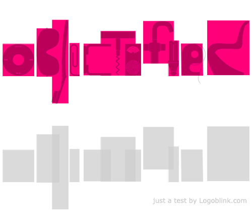
“A while ago we received an email from Gary Hustwit the director of ‘Helvetica – A Documentary Film’ asking our advice on what type I would use for a new documentary he was producing on product design. We replied saying it might be nice to make the letterforms from actual products, he liked the idea, and would we be up for doing it?
We said of course, what’s the title?, “Objectified” he says.”
and here’s the result :
![objectified-logo-final[1] objectified-logo-final[1]](/static/fa95d1c723a8ffaddd537c036dca3b84/10bbb/objectified-logo-final1.jpg)
Definitely a brave approach. And it pays back. As you can read here and there in the NET – the logo is as famous, as the film itself. May be the success of the logo is based on the fact that it’s build by designers for designers.. and this type of audience can appreciate the good idea, the fun of this logotype. The approach is not something revolutionary, the text is a little unreadable, but one have to admit that the final piece is great :)
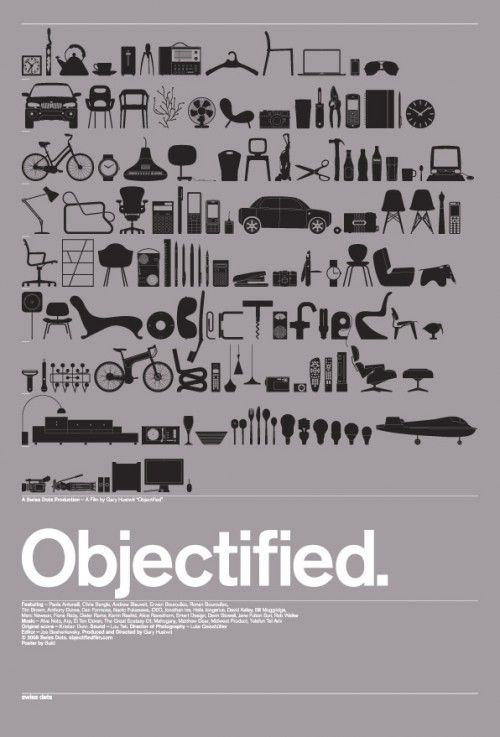
So this is how the logo deserved its central role in the limited movie poster :
![buildprint[1] buildprint[1]](/static/b8e07936637443981097e4d8fef1621f/10bbb/buildprint1.jpg)
How was this logo designed ? Well… as every other logo – revision by revision, experimenting with stuff, things… and objects :)

OK, I guess a little design speculation is allowed :
As you can see the iPod round controller is the base from where everything started and it’s the constant that remained unchanged during the hole process. After all it’s the latest consumers’ icon. A few candidates for specific letters appeared later. The first variations of the logotype are a bit too crowded and claustrophobic. Many tiny and tall object with a lot of curves in the center of the word. There is a lack of a proper rythm for the eye. Later this is fixed. Two knifes have found their place in some of the revisions, but as we all know – as friendly they could be drawn – they are still a negative symbol, so later the swiss knife and the chopper disappear. All the objects are picked this way, so they are parts of various activities in our lives and cary variety of visual and emotional messages. If you half-close your eyes a little bit – you gonna see the balance, the way shapes weigh in the space. A solid start and a solid end of the composition, so that the overall shape could stand in a proper way.
me just… playing with the air… :

And… here comes the big surprise – actually they didn’t use this fine logotype for the official poster. They’ve bet on more illustrative vision with a lot of objects and a plain, super-readable typo. May be it’s because the poster should only be the gate to the work of the crew, not the center of the attention… may be because people are always greedy for more illustrations and a simple logo is not enough… may be because a helvetica typo for the logotype will be the sign that says – “these are the guys that made the helvetica movie”… who knows..
Anyway – both posters are nice :)

Read more about :
Build design studio / Michael C. Place
Buy an “objectified” t-shirt / limited poster
Any comments ?
.