To be honest – I’ve paid attention to this logo just today. The campaign of the “Volt” is at its peak, so I clicked on one of the banners ( by the way – it was a nice banner ). Then I’ve clicked on the video to see a car that pretty much looked like some kind of Honda. After the videos was over I was… like “wait a minute – what was that crappy logo there at the end ?!”. So this is a print-screen…
You’ve found the best web host, incorporated sound web design principles, and it’s fully functional. Your links click through, visitors can read the type, and the tabs are easy to find. It presents your message. But it’s boring, you say? Well, jazz it up! A blog is one of the best ways to get people to your site. Readers love to read opinions about events. Interviews make great blog posts. How-to…
Nowadays, a new wave of creation of corporate identity is growing… The age of static logotypes may has finished, it’s the new era for dynamic logos, here the image can be changed, can move… but, nevertheless, still maintain themselves identity that characterizes them. In this post I’ll show three brands to use as example that what I’m talking about, three brand that use a dynamic logotype. Each…
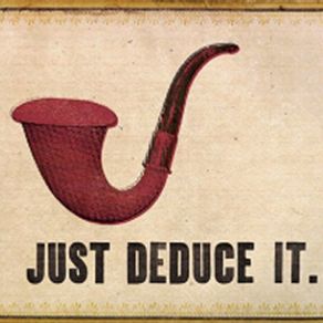
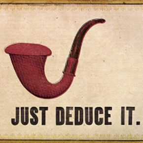
In this post i will show you some spoof logos of the brand nike, were use only the logo, and other cases, the slogan “Just do it”. In the end, i show some interesting “brands”… let see it!
Nowadays there is a trend to use famous brands and print t-shirt designs which making fun of the brands. These are parody logos often not assigned to a genuine brand. In this post I will show you tens of parody variations of the Puma brand. Each of these images are created similar to the official Puma logo on purpose – to make fun of it, and even profit from the distracted customers who want to…
The brand can set one seller’s goods or service from the others’. A brand may identify one item, a family of items, or all items of that seller. So, we can say that a Brand is the personality that identifies a product, service or company. A good brand can transmit to the user/consumer, aspects like thoughts, feelings, perceptions, images, experiences, beliefs, attitudes, and so on that become…
1. Integrity If you want your business to be looked at in a positive light, it would be in your best interest to be as consistent as possible. For example, if you advocate recycling, but do not enforce the policy in your own office building, customers will become confused. If you are not doing what you encourage the public to do, how will they know that you can be trusted? If you want to be…
Johny Wan sent a link to this peace yesterday. First thought – okey, I’ve seen this type of style before… it’s catchy, but where’s the logo story ? After that I saw the logos in the illustration and start thinking that this is actually something not very common. Probably Johny just wanted to showcase his art, but what I’m interested is the aspect of integrating the brand into an image in an…
It’s a speeded up logo design screencast for a new startup called “NomadJob.com” . Basically I did not want something too fancy and experimental. First I bet on few ready-made fonts…, but then I thought – what the heck – I’m gonna give myself a 30 minute frame.. and what I design is going to be what I’ll use. Sometimes some people are more productive in a tight schedule. I guess I’m one of those…
It’s one great small movie about how you can improve your calligraphy. The whole process from the sketch to the placing in photoshop. Thank you Mr. Ortmann Screens: