It’s colorful, it’s extravagant.. and it’s not the typical Euro Championship logo, but with the right presentation everything’s fine.
Actually the video is made back in 2009, but it’s a really good example of how a brand design should be approached and presented. If the London 2012 Olympics logo had the same presentation – I bet more people would be happy with the design. Anyway – this post is about the Euro 2012 football games, so I’ll provide some more images related to the topic:
The logo looks good on B&W backgrounds which is very important.
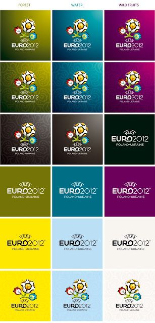
As you can see, a combination of the logo design on a color background is not a problem for the eye, too.
We have to admit – all the graphics are approached very professionally and are excellent examples for good branding.
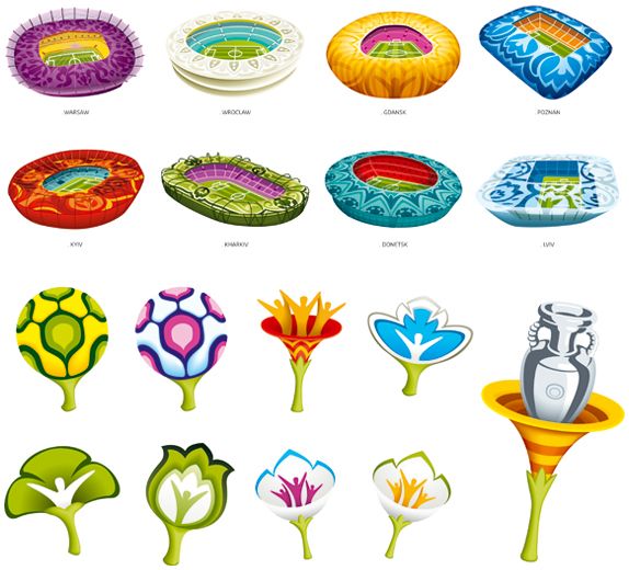
Some materials from the current website of the event:
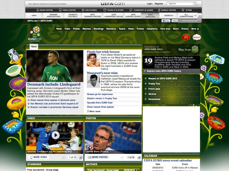
And this is the background file itself.
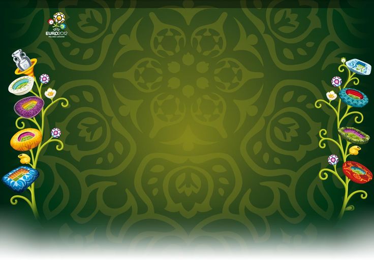
The pattern used alone.

Some banner designs with the floral elements.

A horizontal extended “uefa” version

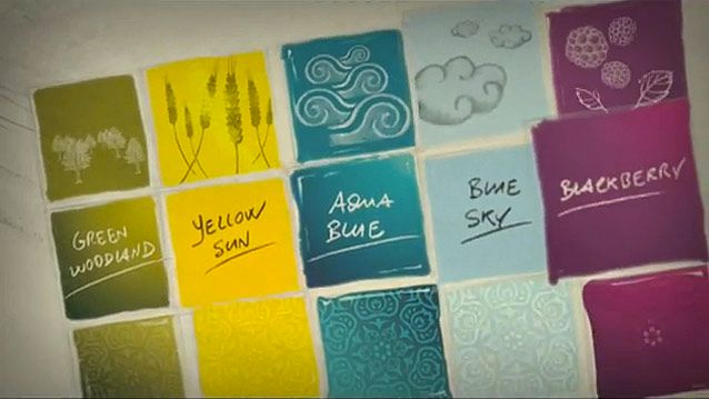
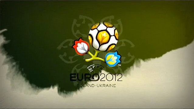
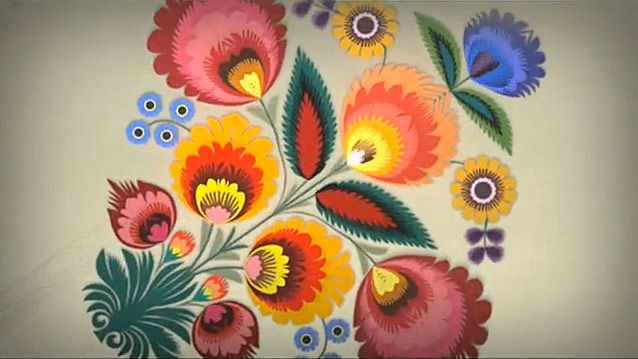
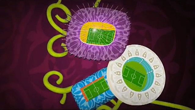
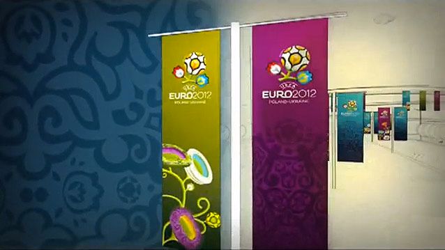
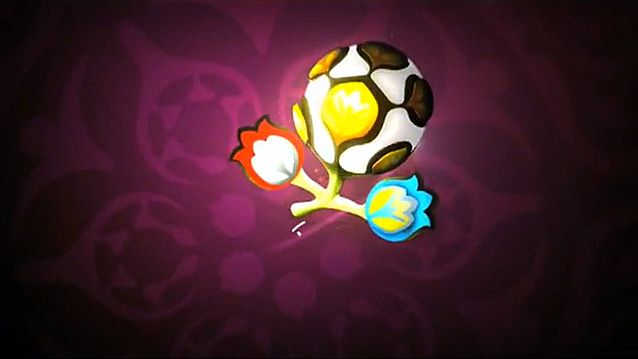
And some hand-picked moments from the video :
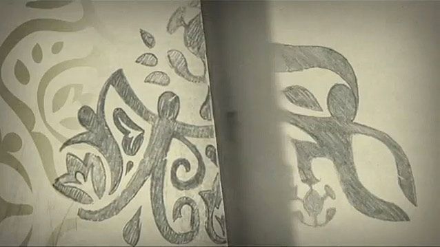
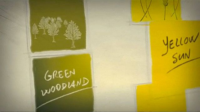

Happy football watching!
Some source:
http://artofvisualcommunication.blogspot.com/2010/08/euro-2012-tournament-identity.html