I’ve just discovered these… May be you’ll recognize some of the songs! well, yes – they are more like pictograms, but still – most of them could be logos 8) Hope you’ll like them and make sure you check Victor’s profile in flickr !
Yahoo Logo in 1994 It is surprise that Yahoo doesn’t have a logo in 1994 when started. Yahoo logo in 1995 :The Jumping ‘Y’ guy Yahoo Logo in 1995 :Going red on the Web Yahoo Logo in 1996 :New Year Logo 1996:Purple on the Inside Yahoo logo in 1997-2004: Y-bang Present ____ The full text from the Yahoo blog: Don’t adjust your monitor. There’s something different about Yahoo!. Everything seems so…
I was thinking to make a research about the cars’ logotypes ( not the main logos ), but I’ve stumbled accross someone’s research that’s actually pretty good and I’m dying to share it with you, so we can make some observations together. It all began ( in my research ) with the two dots over the Citroën’s logotype. Which are actually called “tréma” in French. It’s a small detail that people don’t…
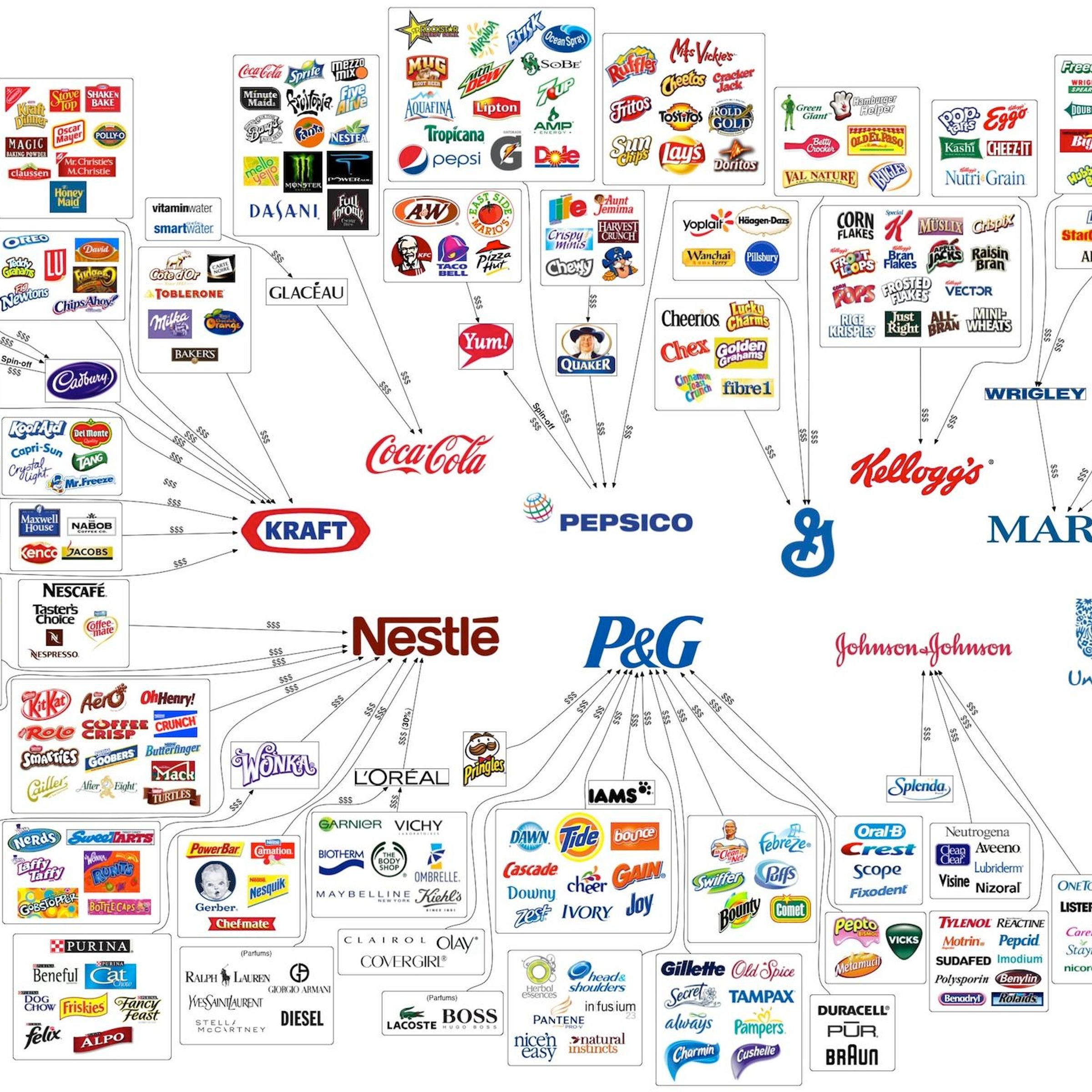
Something interesting that has been going around recently. This 2012 brand logo map design actually can be very informative if read properly. You can easily see the major brands and how their sub-brands are distributed on the market. The image is 2400 px× 1507 px. You may consider downloading it to view it in details. via id29.com.
Any idea what these icons/logos stand for ? They are the Adobe touch logos, launched in 2011, which I somehow overslept :) In case you are wondering ( as I was ) what are these Adobe touch apps for – watch the movie: I’m not sure I’m impressed with the touch logos, but I like the illustration for the recent advertising campaign :)
****
It is one of the two largest tire manufacturers in the world along with Bridgestone. French tire company Michelin has been around for a very long time. This is probably why their pudgy white mascot Bibendum is now intrinsically part of cycling graphic design. We are all familiar with his layered tire appearance, but we may be less acquainted with the history of the brand. It is actually one…
Let’s present you one of the largest snowboard brands in the world – Burton. It is founded by Jake Burton Carpenter in 1977 – he built the world’s first snowboard factory. His variety of products are marketed worldwide in over 4,340 stores with more than 1/3 being located in the US. The key to create a great logo design is flexibility, simplicity and adaptability. When using many details in a logo…
During the 70’s the world was changing … There was an oil crisis, U.S.A. was into recession, Japan grew as a major world power, people started talking about the environment. Many consider these years a the “age of the individualism”. But this period is important for other people, too – the gamers. Video games were emerging. One of the most popular was the Atari console. In 1972, Atari entered…
In this post we are going to take a little journey in time to see how one of the most recognizable movie logos of all time evolved. For this to happen, examples of the Warner Bros. logo design from various movies through the years are shown here. When a Man Loves | 1923 Mystery of the Wax Museum | 1933 The Goose and the Gander | 1935 This is the Army | 1943 The Inspector General | 1949 Helen of…
In this article I’ll write about one interesting and well done logotype …. and try to explain why this can be a good logo design. Karrimor is a brand of outdoor sports equipment and clothing. It was founded in 1946 by Charles and Mary Parsons, and nowadays the Karrimor equipment is “selected by some of the world’s most accomplished mountaineers, combining optimum durability and cutting edge…