During the 70’s the world was changing … There was an oil crisis, U.S.A. was into recession, Japan grew as a major world power, people started talking about the environment. Many consider these years a the “age of the individualism”. But this period is important for other people, too – the gamers. Video games were emerging. One of the most popular was the Atari console. In 1972, Atari entered…
James Dean is an American film actor.He is a cultural icon, best embodied in the title of his most celebrated film, Rebel Without a Cause (1955), in which he starred as troubled Los Angeles teenager Jim Stark. You can read more in Wikipedia :) The thing is that the designers of this retro advertisement have used in a clever way the “D” for Dean to form a round CD-like shape. Just some retro…
This illustration can hardly be called a logo, but still – it deserves some attention. Then I tried to track the label’s origin. Here are a few things I’ve found : Another version of the label Here’s the clean label And this is a book which I found with the drawing on the cover. Here’s where the beer logo appears to come from. Invisible Monsters, written by Chuck Palahniuk. Pay attention that the…
Have you ever tried to count how many people have an impact on the corporate identity of your company? By their work, by making small decisions, but also by their unawareness of the context? Each member of the “branding team” brings their own perspective to every project. Behind every piece of marketing or expression of the brand — whether it’s a business card, a shop assistant, or an advertising…
In this post we are going to take a little journey in time to see how one of the most recognizable movie logos of all time evolved. For this to happen, examples of the Warner Bros. logo design from various movies through the years are shown here. When a Man Loves | 1923 Mystery of the Wax Museum | 1933 The Goose and the Gander | 1935 This is the Army | 1943 The Inspector General | 1949 Helen of…
In this article I’ll write about one interesting and well done logotype …. and try to explain why this can be a good logo design. Karrimor is a brand of outdoor sports equipment and clothing. It was founded in 1946 by Charles and Mary Parsons, and nowadays the Karrimor equipment is “selected by some of the world’s most accomplished mountaineers, combining optimum durability and cutting edge…
Who appreciates a glass of good wine here ? :) What about good graphic design? In this post about wine logos we have combines these two passions of ours. Here you can see 32 conceptual logos of wines from all over the world are presented… Enjoy it!
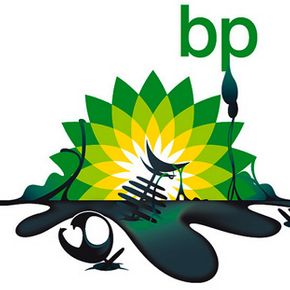
We all know what British Petrolium ( BP ) had caused to the environment … , so here the response of the people trough the eyes of the logo designers all around the world : Also can use film covers, that people are familiar with, to express those opinion, in this case, it’s shown the precise field where they cause damage. Funny results… but huge message!
Coincidence or not, but Apple goes insane after the death of the CEO & co-founder Steve Jobs. Above you can see the present Apple logo and in red – the company they are suing. You can check in the video bellow the real place in Germany – a cafe called “Apple Kid” ( direct translation ). It’s interesting why a big American corporation will make problems to a small European cafe… about a trademark…
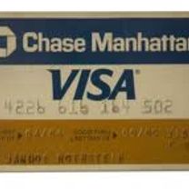
Today I’m gonna talk about one brand that is always present in ours lives… or better… in ours wallet. It’s the famous blue, white and gold logo that has earned a permanent place in the minds of the consumers around the globe… The VISA Brand. The Visa International Service Association, how we know today as VISA, born in 1958 when the Bank of America launched the pioneering BankAmericard credit card…