In this post I am going to present you the history and variations of the Starbucks logo. This includes formation of the genuine design and groups of logo designs as part of the Starbucks logo mania. I have compiled several publications on this topic and I have also included some of my own observations. Hope you enjoy it!

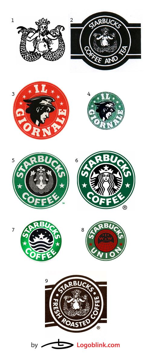
The first logo of Starbucks resembled a “cigar band” (#2) with a Melusine (#1 – the two tailed mermaid) inscribed in it. Sirens or otherwise known as mermaids were believed to be seducers. There is an obvious psychological association between the lure of the fresh roasted coffee, spices, or tea and that of the mythological enchanting creatures.
Michael Krakovskiy is giving some valuable and interesting information on the Starbucks logo creation in his web-post “How the Starbucks Siren Became Less Naughty“ . The first logo (#2) was created in 1971 and in comparison to the Melusine (#1) one can “…[n]otice that the graphic designer removed the belly button, the unattractive shading around the bulging tummy of the 15th century siren and merged the tail-legs to remove the suggestion of naughty bits. The logo Siren also smiles a little while its 15th century doppelganger is looking rather grim. Other than that it’s clear that this is exactly the image that he or she was using.”
Later on, in 1985-86, Il Giornale (the first coffee drink concept store in Seattle) had its logo designed (#3 and #4) by Doug Fast (the designer of the green Starbucks logo – #5 and #6). In his book Pour Your Heart Into It: How Starbucks Built a Company One Cup at a Time, Howard Schultz shares about Il Giornale: “Our logo reflected the emphasis on speed. The Il Giornale name was inscribed in a green circle that surrounded a head of Mercury, the swift messenger god.” [pg. 88] What is not wide-spread is that Howard Schultz was still an employee at Starbucks when he opened Il Giornale.
Soon after, in 1987, the owners of the Starbucks decided to sell the business and Schultz “[…] jumped at the chance to buy Starbucks and remake it into the espresso bar concept he had just begun at Il Giornale […]”. As one can easily see, the 1987-1992 logo (#5) is partially based on the Il Giornale logo (#4). The siren is more stylized, the breast is hidden, but the belly button is still shown. As Doug Fast explains in a letter to Krakovskiy : “I did the green “full siren” logo with a stronger, simpler, read for reproduction. The SBUX type was HAND DRAWN and based on the typeface, Franklin Gothic (this was pre-computer, folks) and had to be drawn so it bent well, around the circle. We submitted the logo to Howard, one with a red color and one in a green color. He picked the green color option”.
The current green logo (#6) is a cropped and zoomed version of the siren. There is only a hint of the tails – people not acquainted with the previous versions of the logo might be confused what exactly are those things next to the mermaid’s head. Currently, Starbucks came up with a newer version of the old “cigar band” logo (#9), in which the lines are clearer, the belly button is removed, and the chest of the Melusine is hidden by her hair. The company have done this most probably to evade the possiblity of being accused of using an offensive image.
The #7 logo is a neon sign, variation of the logo, used only at certain locations worldwide. #8 is the logo of the Starbucks Workers Union – same concept, but as you can see the mermaid is replaced by the Workers Union logo. For further reference you might want to check out the article [“The Evolution of the Starbucks Logo”](http://brandautopsy.typepad.com/brandautopsy/2005/06/theevolutiono.html).
Similarly to most of the American brands that overwhelmed the world, Starbucks is also being associated with a negative brand image. The company has been accused of exploitation, low worker’s wages and benefits, putting small coffee shops out of business (the so called mom and dad shops), and last but not least being unsustainable and not environmentally friendly.

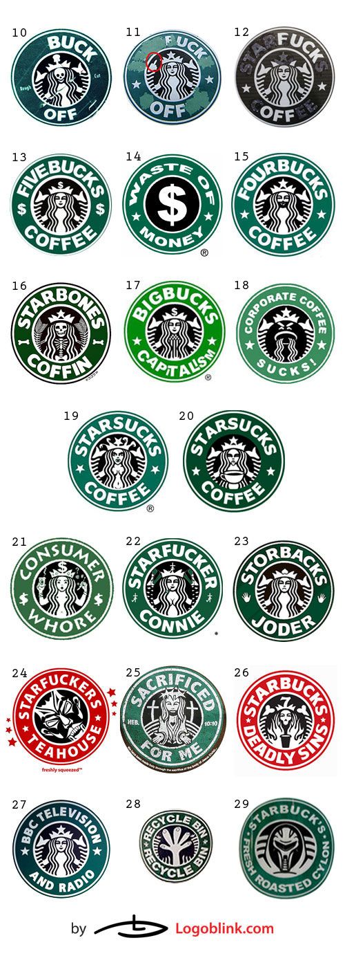
As you can see above, there are many variations of the Starbucks logo, which are oriented towards sending a message to the consumer and increasing public awareness. Once you scratch couple of the Starbucks letters, you can come up with variations like Buck Off – [to cause, to fall off] (#10) or Fuck off (#11 and #12). #10 (found on Flickr.com) is a stylized and modified version of the original, while #11 and #12 are simply made by scratching certain letters and elements to arrive at the “Fuck Off” slogan, the middle finger in #11, and the horns in #12. Recently, a film called “Buck off” was released. Louis Louzou is narrating the tale of the campaign against the St James’s Street Starbucks.
There is also a worldwide uproar against the high coffee prices that Starbucks maintains – see logos #13 to #19. It is well known that coffee is a high gross margin consumer product, meaning that the price mark-up is usually an extremely high % in the coffee industry. Thus, big corporations like Starbucks are charged with unethical behaviour – paying cents to crop producers and minimal wages to employees, while at the same time selling a cup of coffee for $5. Along those lines go all the logos I have compiled in the banner above.
In #23 Joder is in Spanish slang and means Fuck, so the connotation it bears is the similar to the other logos presented in this group. #24 to #26 are logos that contain religious elements, even a citation from the Bible in #25. You might wonder what is #27 doing in this image, but I guess that most probably this logo was created in reaction to the dubious practices (like “greedy expenses and large salaries”) of BBC’s senior managers.

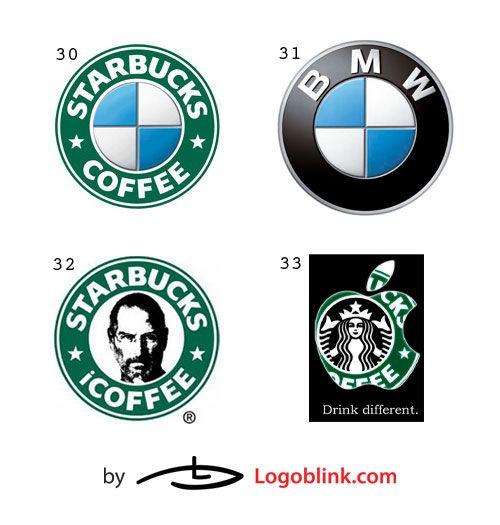
The four logos in this third collective image are associations made between Starbucks and two other big companies – BMW and Apple. In the BMW case, apart of the simple geometrical identity, I see a positive **imaging of Starbucks – the idea behind seems to be that the coffee at **Starbucks is like the BMW among the cars. I will leave the judgment to you.
The Apple case is a little bit different. In 2007, Apple and Starbucks announced music partnership – Starbucks customers (in participating locations) will have a free access to iTunes online music stores onto their iPods or iPhones. It is obviously a marketing campaign aiming at allying the two big “modern and trendy” American brands that conquered the teenage world despite the widely accepted negative image (especially in Europe). It is more than cool to drink from a Starbucks cup, while listening to your iPod ;)

In this fourth collection the twist on the logo is different. Here I have compiled the so known rip-offs. Some of those logos can easily fall into the copycats’ folder, but for others it is only certain elements that are taken. The former can be easily spotted and believe it or not, there are all existing brands. I will not dwell upon the corporate success of those coffee shops or stores that ripped off the Starbucks logo. More interesting to me are the common elements and the location of those places.
Obviously, the green colour, the font and bolding of the letters, the stars (both as graphic element or contained as a word somewhere in the naming) on both sides are present in the most blatant rip-offs. For example #34 is an online locator for independently owned stores, aiming towards people that prefer to drink their coffee in non-corporate owned cafes. #35 is a coffee shop based in San Diego, CA, #36 – Taiwan’s largest coffee chain with more than 230 locations, #37 – South Korea, #38 – Mexico, #39 – Addis Ababa, #40 – Shanghai Xingbake (xing-‘star’ in Chinese, bake is the phonetic rendering of ‘bucks’), #41 – China, #42 – Harbin, China, #43 – Japan, #44 – Taipei, #45 – Shanghai, #46 – Iran, #47 – Downtown Middleburg, #48 – Mt. Clemens, Michigan, #58 – Marina Del Rey, CA, and #59 – a hair-dressing studio that used the ‘Siren’ as a part of its name. As you can see for yourself those can be easily mistaken for a Starbucks logo, but some of them are not even in the coffee industry.
As for the other logos included in the same picture, it can be argued that some of them are not rip-offs, but are rather inspired by the seal stamp design approach, which is quite plausible. As for #52, the logo might imply that it is a brand owned/supported by the famous actor Al Pacino, but Pacino as the actor is spelled with one ‘c’, while the brand is with double ‘c’. It is a common Italian name, but the silhouette resembles the famous actor as well. The slogan contains a movie starring Pacino. The overall design is following exactly that of Starbucks, but with different colours.
I still wonder, where lies the thin line between speculation with imitation and the use of established etalon like the seal stamp. Is it better in such an industry as the one of coffee concept shops to be unique or to mimic what is already created a hype and setted a trend?

I will conclude the Starbucks Logo Mania with this fifth gallery, which compiles the so called ‘fun’ variations. As you can see, the Starbucks permeated in conceptually different areas of our lives. #62-64 are simply versions of the original, featuring different elements. The marmaid is substituted by a fair dj lady in #62, while in #63-64, the siren is replaced by a dancer and a fire, respectively.
The Star Wars – Starbucks association is one that comes to mind easily. There is a graphic design diversity starring Lucas’s personages – see #65-69.
70 is a Photoshop Challenge : Improve the Strabucks Logo. Most of those variations are straightforward.
76 I find interesting to look at – ‘Queen Esther’ (esther=star) – a Jewish Queen. There are speculations about Starbucks being of Jewish origin, but there are no proven ties.
The rest of the logos are simply cartoon modifications of different kind – #78 The Simpsons, #79 Southpark, #80 Manga, #81 a stylized Starbucks siren. The last logo in this collection is a blend between that of Grateful Dead and Starbucks. The former partnered with the coffee chain to create a new 2CD compilation – Eternally Grateful.
I bet there is much more to be said about Starbucks and their brand identity, but I will refrain from being too wordy or judgmental. What I wanted to do is just to compile a collection of Starbucks inspired logos that will prove by its mere display that the Seattle- based corporate giant had penetrated various levels in our everyday lives, motivated, annoyed, and provoked many throughout the world.