Warning : Doyald Young’s story is so inspiring that you may want to play the movie below again and again. It is 39 minutes long, but it’s totally worth. Video at the end of the post. Here are some screens and words from it: One of my heroes says : I do not want to draw a beautiful letter, I want to draw a good letter. Why make another logotype, when there are thousands of fonts out there…
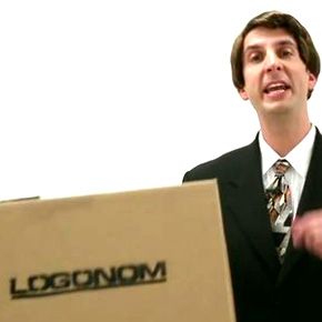
Update 2019 Service is no longer available. Actually it’s a new free tool for custom fonts, but it also looks an easy alternative tool to make a great logotype. Watch the movie or just go and experiment. I don’t have a printer around me so I’ll try it next few days. How it works ? 20 sec registration. print the layout take a snapshot of the already filled layout and start mastering your typo Why…
Grab the popcorns and the ice-cream with your favourite logo and sit down to enjoy this epic logo spoof. Pay attention- the movie is 8:35, but it’s worth watching. In case you are asking yourself “What’s this thing” ? – It’s an AICP 2010 Chicago Sponsor Reel. Made by Optimus and ONE… whatever this should mean :)
So this is the limited edition poster of Ibraheem Youssef and the interesting part is that all these logos are illustrating the top Youtube movies for 2010. I guess one can take notes how some things are done or what to avoid. Overall – good job. Which one is your favourite logo here ? He’s writing in his blog :“Paul and myself enjoyed working on this thoroughly throughout December, It started off…
This is a video from the exhibition in Krakow, Poland by Magdalina Stancheva. Pay attention how they’ve ordered the logos in a grid and then put a light spot on the personal logo of Stefan Kanchev – the “eye”. Rumors are : a book about Stefan Kanchev will be published in the summer of 2011 in English. We’ll keep you informed about the progress :)
If you are not watching television or just MTV, may be you haven’t seen this logo yet. Client: Mtv.de Agency: bbdo.de Executor: s-farm.de Found via: pinkEYE The logo is a part of a short video spot. Watch it here:
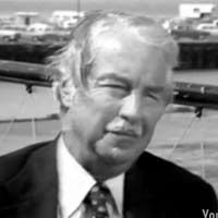
Hope you’ll appreciate this rare Landor’s interview. It’s uploaded a month ago.. but still it has 4 votes.. so I guess, just a few real logo designers has seen this before you and me :) Enjoy!
The video you gonna see is just a theory I found while I was browsing. I’m not saying it’s great or bad. I’m just posting it here, because there are certain things that you could find useful. The only thing I’m sure about is that this recommended shape is making things easier for positioning your logo in many layouts & grids. As usual – if you have an opinion – feel free to share it :)