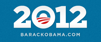
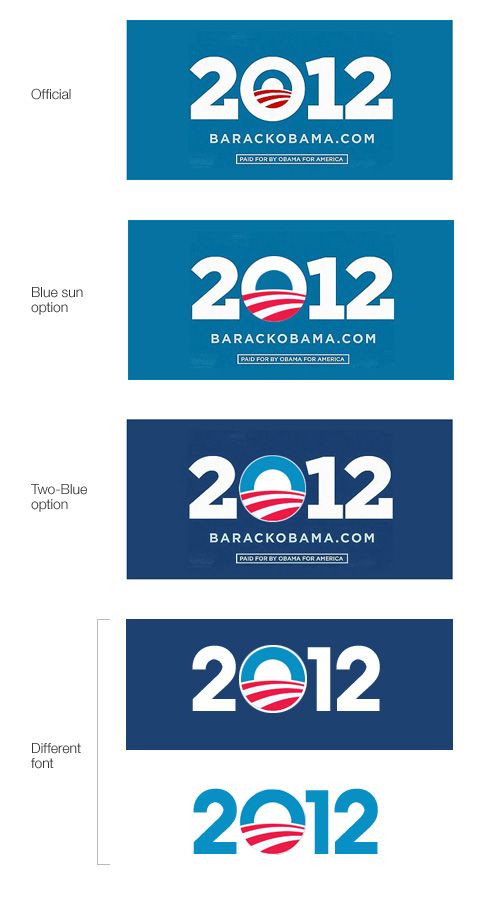
This is the official Obama 2012 campaign logo. No surprise that they are sticking to the logo form the previous campaign. After all, it worked out pretty well for the previous campaign. I’ve read somewhere that the used font is called Gotham Serif. I was wondering what the logo would look like if the stroke was not part of the design, so that it could be bigger and more recognizable. Fortunately, I found that somebody else experimented with this idea as well, so I didn’t have to do it myself. :) The following versions are designed by Scott :
After reviewing the variations we can conclude that they used the white stroke and sacrificed the scale in order to be able to use blue background. I like the original version – it’s elegant in this scale for sure.
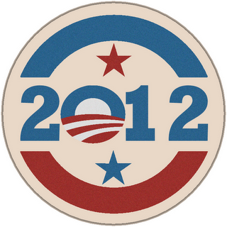
This is a campaign logo design with a more traditional, vintage look. As far as I know this is not an official logo, but it’s interesting in its own old-school way.
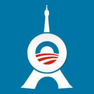
This logo is designed by Ethan for the Paris Fans of Obama.
An interesting interpretation I wanted to share. :)

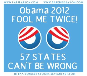
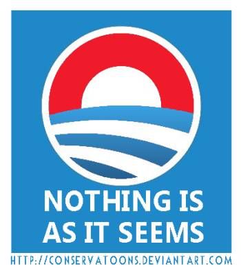
The upper one was a little bit hard to guess. I wasn’t sure if got it right, but seeing the small version in another site explained it all.
Clever approach. Not too offensive or obvious, but it definitely makes you think about it.
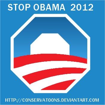
The spoofs are from Devian Art as it’s written on the pictures :)
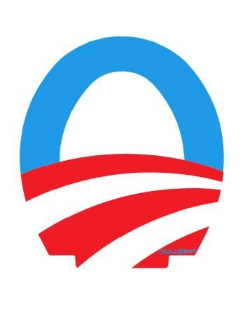
Some logo questions are popping up like: is it OK to make neat minimalistic masterpieces for campaign logos when they appear to be very fragile in terms of spoofs and malicious redesigns? Are the people who gonna appreciate the clean and elegant shapes more than the people who gonna appreciate the toilet seat shape?
We’ll see the answer when the elections are over.
