The superheroes we all know from movies and comics are always hiding their true identity and that’s why they express their presence with other symbols like outfits, phrases and as some of the most famous companies nowadays – with logo. The curious thing about the heroes is that their logos are perfectly fitted to the guidelines the corporate world uses today – they are recognizable and original…
A lot of praise could be said for the talented graphic designers from all over the world and their work. This post will open a word about the ones who made their way from Japan. The Japanese graphic designers’ work embodies rich culture, traditions, colors, shapes and concepts, which are a way far from the western world’s tendencies. After the war the country of the “rising sun” turned out with a…
Leo Messi is one of the most popular football ( soccer ) players in the world these days. Adidas has a special football-shoe line called after his name. So they needed a logo. And a young lad called Nathan Shinkle designed it : messi_logo_adidas_001-960x400 messi_logo_adidas_002-960x400 messi_logo_adidas_003-960x400 messi_logo_adidas_005-960x400 And here’s the animation from his dribbble profile…
Here’s a step by step short tutorial on how to design a hipster logo. Few steps. Simple process. You can’t get it wrong, believe me. Make sure you check the hipster behance profile of the author – Tim Delger
This was inevitable. Moving from a “gradient web icon” to a classic logo is always a matter of time. Yes, that’s why it’s called a logo, not an “icon”. It has certain graphic advantages and could be used everywhere. On cakes, on uniforms, on extremely small scale, etc. This is the real sign that Dropbox is moving to another level. The level where it’s not enough to have something like a web…
With the introduction of Facebook Graph Search new design elements appeared and some existing ones changed. Probably we can define this as the rebranding of Facebook in year 2013. You probably can already see this images in the design of your facebook profile page.Probably the reason for changing the new logo was the idea of making it negative in the top bar. This logo design move is turning the…
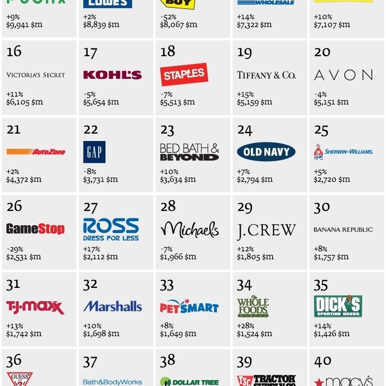
A few days ago Interbrand revealed their “Best Retail Brands” lists for twelve regions! Those lists of top brands are created based on solid arguments and reports. Some of the lists are quite short (Australia’s is a short Top 10 BRB list), whereas others are quite long. The logo set above shows what is probably the most interesting list of all – the Top 50 U.S. Best Retail Brands for 2013. Most of…
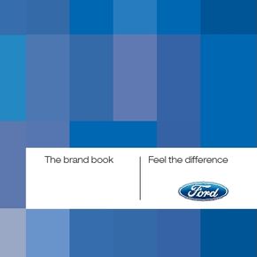
Ford Motor Company is one of the most famous multinational automakers in the world. Founded back in 1903, the company has changed its logo several times. The current logo design is very famous: According to the company the Ford brand book is published in order to “restate what the brand is about”. I have uploaded a few screens from the brand guidelines which you can see below. The brand guidelines…