May be most of you know one of the symbols of the communism – the russian car – Moskvich. Some photos of this Moskvich 408 Coupe ( very rare – they say there are only 2 cars like this in the world ) have inspired me to find pictures of different Moskvich logotypes. The badges on the back of the car, not the front logos. This is the best picture I’ve found. A lot of models on 1 place. Nice…
Hope you’ll find some inspiration for you logotypes in this calligraphy video. The pictures bellow are screens from the video itself. Elite is a cultural festival and you can read more about it here.
I was thinking to make a research about the cars’ logotypes ( not the main logos ), but I’ve stumbled accross someone’s research that’s actually pretty good and I’m dying to share it with you, so we can make some observations together. It all began ( in my research ) with the two dots over the Citroën’s logotype. Which are actually called “tréma” in French. It’s a small detail that people don’t…
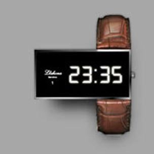
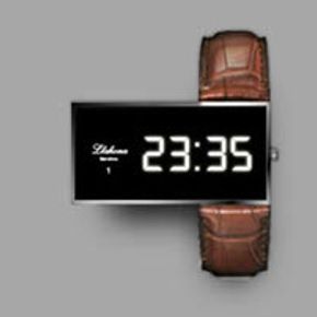
The logotype itself is nothing special, but the positioning is great. This design shows what you can achieve with just a little juxtaposition, with thinking different in a niche where it’s always the same. This watch makes an impression for sure. “Design provides emotion to our life” is the mantra of Spanish designer Oriol Llahona, the man behind Numero 1 watches. With the sentiment being equal…
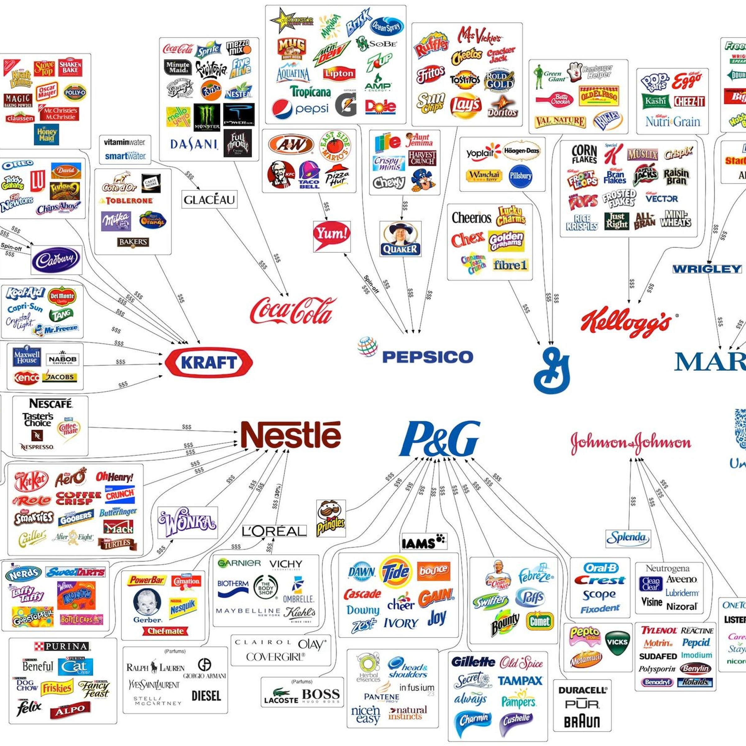
Something interesting that has been going around recently. This 2012 brand logo map design actually can be very informative if read properly. You can easily see the major brands and how their sub-brands are distributed on the market. The image is 2400 px× 1507 px. You may consider downloading it to view it in details. via id29.com.
Daimler, the world’s leading luxury car manufacturer, decided to create a joint venture with BYD, China’s leading economy car manufacturer and this is how Denza appeared. Basically – it will be the local “Mercedes”. That’s why I’ve used this catchy title. The Denza brand is due to consist of a range of electric power vehicles with the first model set to use the underpinnings of the first…
I was watching some Youtube video for some app when I saw this funny android-appstore logo and decided to find the Android Brand Guidelines. Surprisingly – they are pretty short. You can click to zoom in the print-screen from the site. The shot is taken today – 26.04.2012. Who knows – may be the android guidelines will evolve someday, but for now they are pretty short. Source: http://www.android…
Although it’s not my favorite style ( because it’s too illustrative ) – the logo of this wine label is damn good and deserves recognition, isn’t it ? :) Salla White by the Labelmaker Graphic design & Illustration – the Labelmaker Photo – Jordan Jelev Print – Rotoprint 2012, Bulgaria
You are probably working with fonts from some time now.. and you don’t consider yourself as a type nerd, but it’s a good thing to go back to the basics and check what’s what. Here you go – practice : Stem Counter Shoulder Serif Ascender Arc of stem Link Loop Ear Serif Arm Crossbar Ascent Ascender line Cap height X-height Baseline Descender line Descent Apex Aperture Finial Axis Crotch Leg Chin…
It’s always hard to present a logotype in an original way when it comes to motion graphics. We’ve seen all kind of fades, particle animation, drawing, spinning, you name it. But simplicity will dominate forever. Just a simple step by step, stem by stem appearance with some cool rhythm can make the regular “allien movie” looks interesting.